
On-chain analysis is fascinating to me. Exclusive to the blockchain, it doesn’t exist outside of crypto. But in jumping on-chain, we can often get intriguing insights into market sentiment, and specific indicators have even been predictive of future price action.
Of course, given Bitcoin’s short history of just over a decade, it’s not yet clear which indicators are just coincidences and which have real value. But that’s part of the fun, right?
Percentage of Supply in Profit
I came across an exciting indicator this week on Twitter, compiled by @OnChainCollege, who is a great follow if you’re into on-chain analysis. He looks at the percentage of Bitcoin supply in profit to gauge how overheated (or cooled off) the market is. Historically, this has signalled the start and end of the bear markets quite well for Bitcoin.
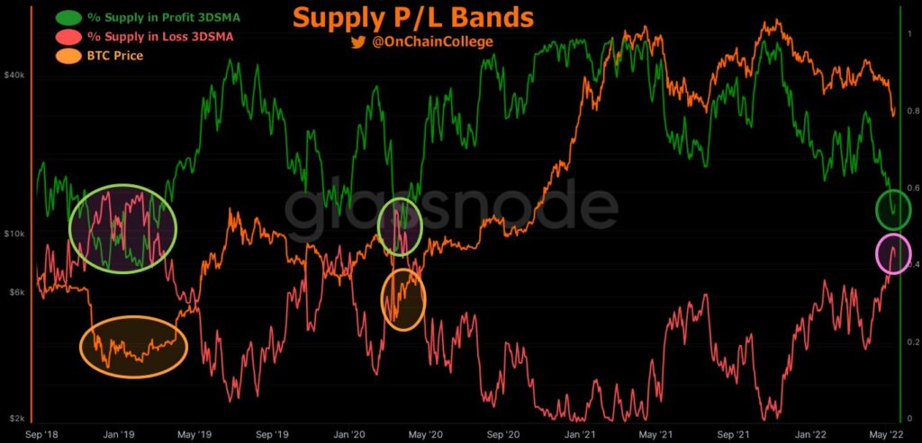
And these bands are very close to crossing right now.
To explain what the metric is, for those who don’t know, profit supply percentage refers to the percentage of existing bitcoins where the current price is higher than the price at which those bitcoins were purchased. When the percentage of the offer in the profit exceeds 50%, it is a strong signal. When the percentage falls below 50%, it is a low signal. Or so the theory goes.
The graph below shows this, going back to 2011. Note that @OnChainCollege graphed it by placing the percentage of supply in loss (red) on the chart too, as well as the percentage of supply in profit (green). These two lines crossing would be the indicator.
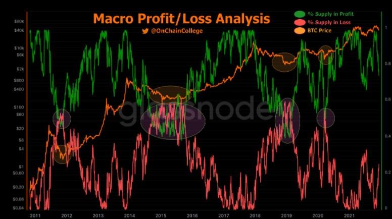
Historical accuracy
As you can see, this has only crossed four times before. The most recent dates back to March 2020, when the outbreak of COVID shook the markets. In my opinion, it was the scariest time in the history of crypto – a real existential event (to be honest, it felt like an existential crisis for the world as a whole).
To play devil’s advocate, you could probably write this instance off as a black swan event, and overlook the impressive bounce that followed the crossover here – fine. But in looking at the other cases, the prediction ability holds in all three cases: 2019, 2014 and 2011.
It’s all very beautiful. But what is the market saying now? Well, the loss supply percentage has not yet exceeded the profit percentage. If the pattern holds, it means there may still be more pain to give before the bottom is reached.
Caveats to On-Chain Analysis
Obviously, any on-chain analysis comes with the caveat that not only is the sample space small, but the data may be non-structural, with material changes to the landscape. Today, we are seeing rampant inflation, a hawkish Fed and a scary geopolitical climate. This has triggered the worst start to a year for stocks since 1939.
These macro headwinds mean that, for the first time in Bitcoin’s history, it is swimming upstream against serious and consistent bearish sentiment – April was the worst month for stocks since October 2008. Additionally, Bitcoin has not almost nothing in common today with the internet money niche. it was back in 2011, maybe even 2014. Today, it takes its place among the authentic asset classes, with institutional money pouring in and a seat at the macro table.
All this means that there is far from a guarantee that history repeats itself here, should these bands cross again. Nonetheless, it’s a fascinating trend to keep an eye on and a neat use of on-chain analysis from an analyst who is a personal favourite of mine. It will be fun to track going forward.