In today’s on-chain analysis, BeInCrypto takes a look at the HODL Waves and Realized Cap HODL Waves indicators for Bitcoin. The goal is to try to determine what stage of a bear market the largest cryptocurrency and the overall digital asset market is in.
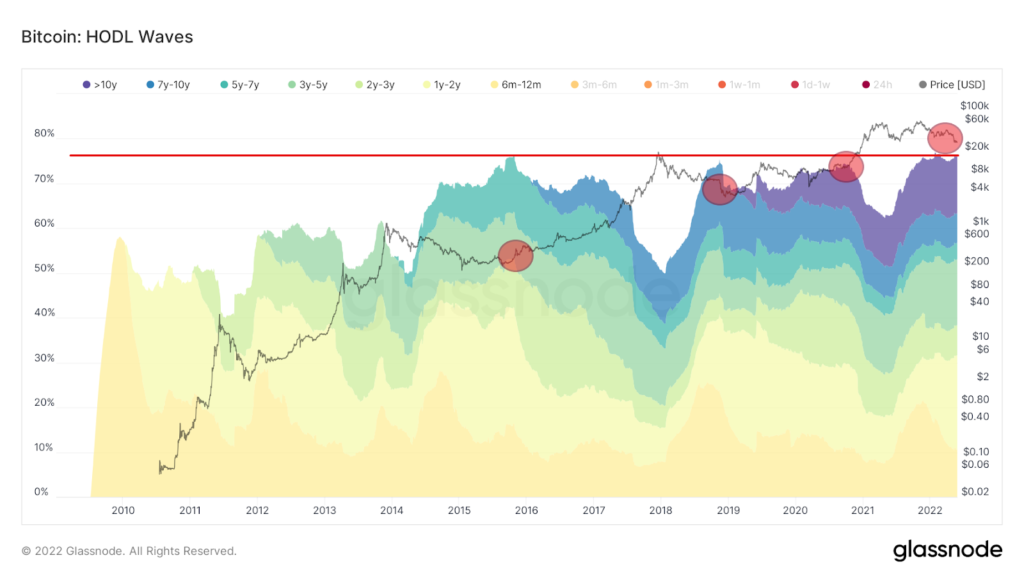
HODL Waves is an on-chain indicator that displays a set of all active supply age bands. Each colored band indicates the percentage of existing BTC supply that was last moved in a given time period.
The colors from yellow (6-12 months) to purple (more than 10 years) illustrate BTC supply that last moved more than 6 months ago. Therefore, this range can be effectively used to estimate the behavior of long-term hodlers (LTH) of Bitcoin. By definition, they hold their assets for a minimum of 155 days, or a little over 5 months.
On the long-term HODL Waves chart for the range of bands we have defined, we can see that their size is nearing an all-time high today (red line). There have been situations before where such a large percentage of the BTC supply has been idle for more than 6 months. These were correlated with the end of a bear market or a period of accumulation before a next bull market (red circles).
Realized Cap HODL Waves
A similar perspective is provided by the derivative of the HODL Waves indicator, which weights it by Realized Price. The latter is the realized market capitalization divided by the current supply. The resulting ratio is called Realized Cap HODL Waves. It also includes the short and long-term age bands of recent active supply.
If we only include long-term (6-month) waves here, we get a chart of the big rises in this range in historical bear markets. The wave peaks in this range were reached at the very end of the long-term bear market (blue arrows) and during the March 2020 crash (green arrow).
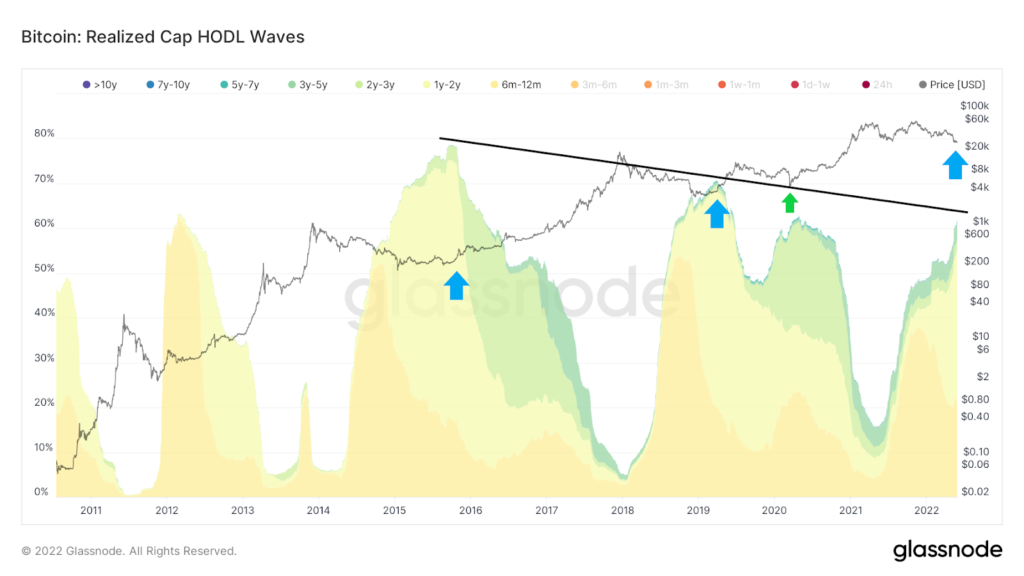
Moreover, subsequent peaks are lower and a descending trendline (black) can be drawn. The current percentage of long-term bands is approaching the line. However, it is worth noting that the current rise in the long-term range of Realized Cap HODL Waves has been very dynamic in recent weeks. Meanwhile, the previous two historical peaks were reached in a more moderate, “rounded” manner.
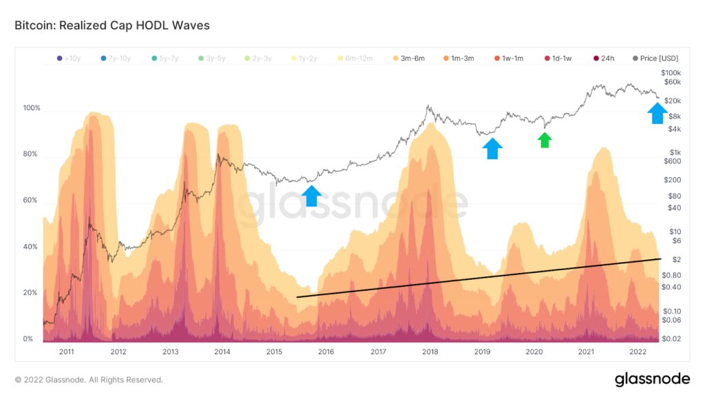
An inverted graph of completed Cap HODL waves provides additional insight into this situation. It only takes into account short-term supply of less than 6 months. Here we see a systematic reduction in the supply of short-term holders during periods of longer-term bear markets.
Also on this chart, an upward trend line (black) can be drawn. It shows that with successive cycles more short-term supply remains in the market and the corrections become slightly less deep. If the trend line holds this time as well, we can soon expect a rebound in the Bitcoin market.