Today’s on-chain analysis by BeInCrypto looks at three indicators that are currently at key support levels. Their holding could be a strong signal of Bitcoin (BTC) reaching a bottom, rebounding and ending the downtrend.
Dormancy flow
Entity-adjusted dormancy stream is the ratio of current market capitalization to annualized dormancy. It is expressed in USD. The indicator can be used to try to determine the bottom of the BTC price when it enters the green zone below $ 250,000.
The current value of the Entity Adjusted Dormancy Flow has just entered the green area and is today at $242,000. Apart from the present time, this area has only been reached twice during the last 2 years (green circles).
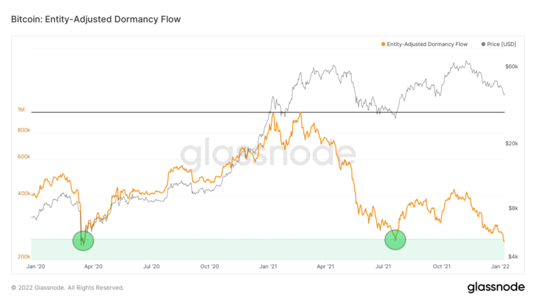
In both historical cases, this coincided with a macroeconomic trough in the BTC price. The first time Bitcoin hit the $ 4,000 zone during the COVID-19 crash in March 2020. The second time Bitcoin hit $ 29,000 in July 2021 and completed a 55% correction from all-time high April 2021.
Today Bitcoin is at the $42,000 level and Dormancy Flow is giving the same signal. If the level is defended and the indicator bounces off the green area, a violent continuation of the BTC price rise is possible. This is what happened in the two previous cases.
Reserve risk
The reserve risk indicator is defined as the price / HODL Bank. It is used to gauge the confidence of long term hodlers in the price of Bitcoin at any given time. When confidence is high and the price is low, there is an attractive risk / reward ratio for the investment (the reserve risk is low). When confidence is low and the price is high, the risk / reward ratio is not attractive (the reserve risk is high).
The current Reserve Risk value reaches – similar to the Dormancy Flow – the upper part of the green area, with a value of 0.0027. It has historically marked good areas to buy Bitcoin where the risk/reward ratio was favorable.
Interestingly, these values served as support during the 2012-2013 bull market (green ellipse). A rebound to this level was a signal for subsequent parabolic increases in the BTC price.
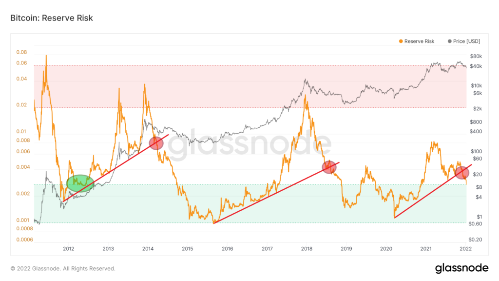
However, there is also another interpretation of this chart that draws a definitely bearish scenario. Well, in the previous two cycles, Reserve Risk respected the ascending support line (red). At that time, Bitcoin reached peaks without breaching this line. When support was lost (red circles), this was a signal for a bear market.
It turns out that such a support line was also in place for this cycle and had already been broken in early December 2021. If we interpret this event in the same way as the previous two cycles, Bitcoin has already entered a bear market. .
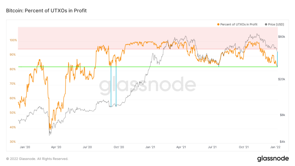
UTXOs in Profit
The final indicator for today’s on-chain analysis is UTXOs in Profit. It indicates the percentage of unspent transaction outputs whose price at the time of creation was lower than the current price. In other words, it is one of the indicators by which you can tell what percentage of BTC holders are in profit.
As with the two indicators described above, profiting UTXOs are also at a critical point today and point towards the 83% area (green line). This level served as support during the BTC price correction in September-October 2020, just before the parabolic rally. Bitcoin was then in the $ 10,000 zone.
In the second case, this support held at the end of July 2021, following the aforementioned correction from the ATH in April 2021. At that time, the Bitcoin price bottomed at $29,000.
Today, the indicator is in a similar zone. Its holding could be another signal that the $ 40,000- $ 42,000 area will serve as BTC’s next macro bottom before the rise continues.